
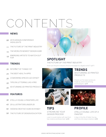
Table of Contents layout draft

Today, I used Canva.com for the table of contents templates. I chose this one specifically because it was very subtle but still nice enough to include. It looked organized and had a slight touch of light purple on the sides. However, for my official contents page, I would like a different font because it wasn't as bold or eyecatching as I would have liked it to be. Additionally, If possible I'd like to make the colors on the side different to represent the LGBTQ+ flag. 


Comments

Popular posts from this blog

Final double page spread


Conventions

 Magazines require certain conventions that they all need to follow. I will mention and explain them below.  •Nameplate/masthead- The font that makes the magazine recognizable. It is specifically designed to attract an audience.  •Taglines- Taglines are used to show what the magazine is about. •Coverlines- Coverlines mention the topics included. •Central image- The central Image draws an audience before they can even read the magazine.  •Cover model- Cover models are usually celebrities that have a strong connection to the magazine's genre.  •Color scheme- The color scheme is used to target a demographic.  •Barcodes- Barcodes are used to Identify your magazine.                  Reference: https://www.slideshare.net/shsgmedia/magazine-conventions-andterminology                                           ...

Using Camera Angles

Today, I took photos using the three camera angles from the syllabus. These consist of a high angle, low angle, and canted angle.  1) High angle  This high angle conveys the idea that the subject has less power than I do.  2) Low angle  This low angle conveys the idea that the subject is powerful or holds more power than I do.  3) Canted angle This canted angle suggests that the subject is disoriented.